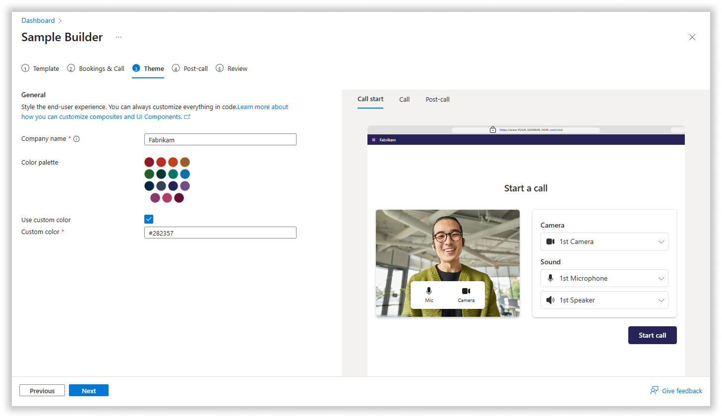
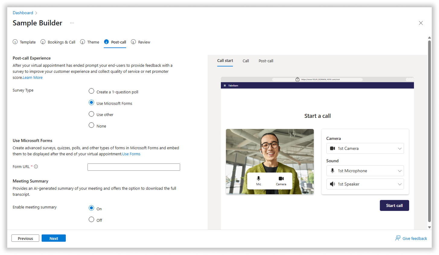
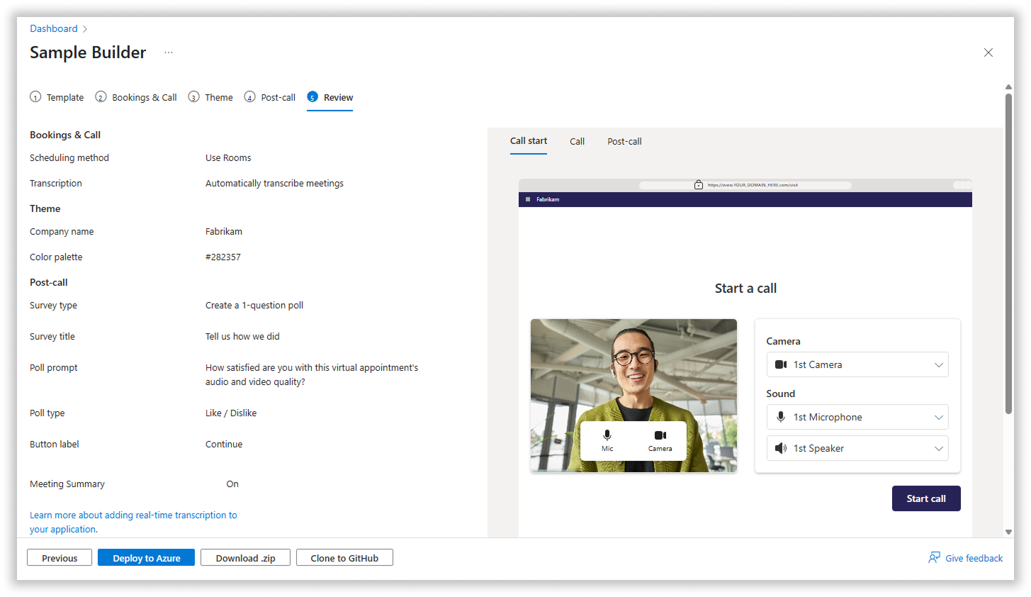
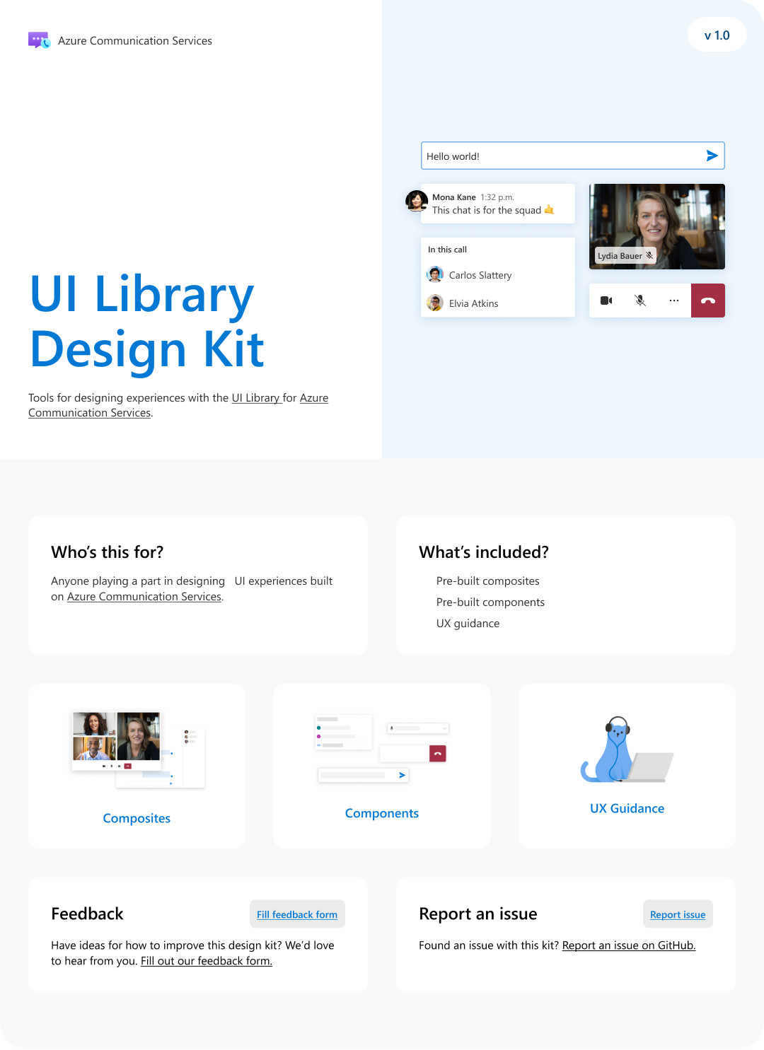
Many of our customers do not have access to designers and as a result do not have the expertise required to create elegant, accessible UIs. The UI Library for web and mobile is designed to make it easy for customers to create simple, elegant, and accessible UIs custom-designed for their particular users, without requiring the design expertise found at a company the size of Microsoft. The library consists of a set of UI components, as well as a group of composites that combine multiple components in commonly used patterns. Lastly, we created a
UI Library Figma Toolkit which makes it easier for customers to design their UIs.
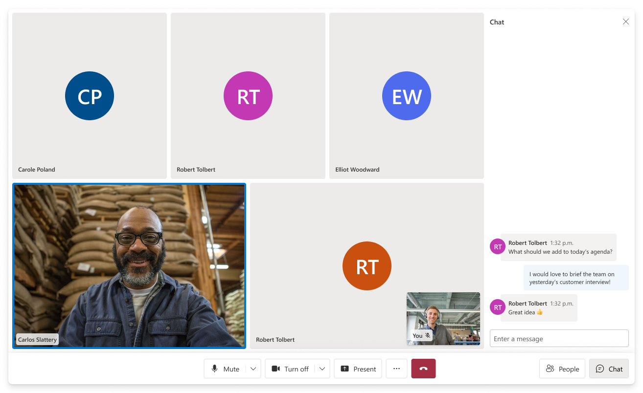
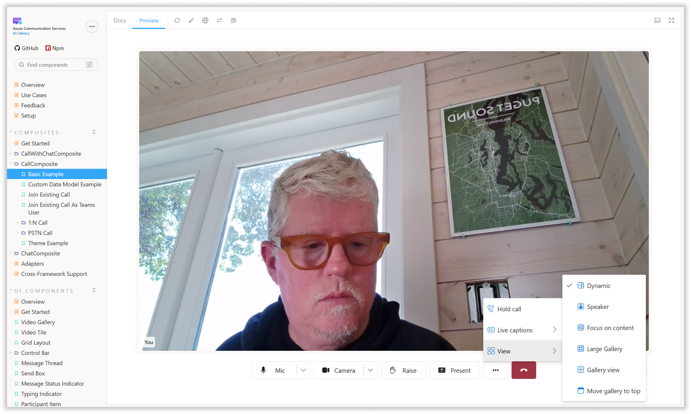
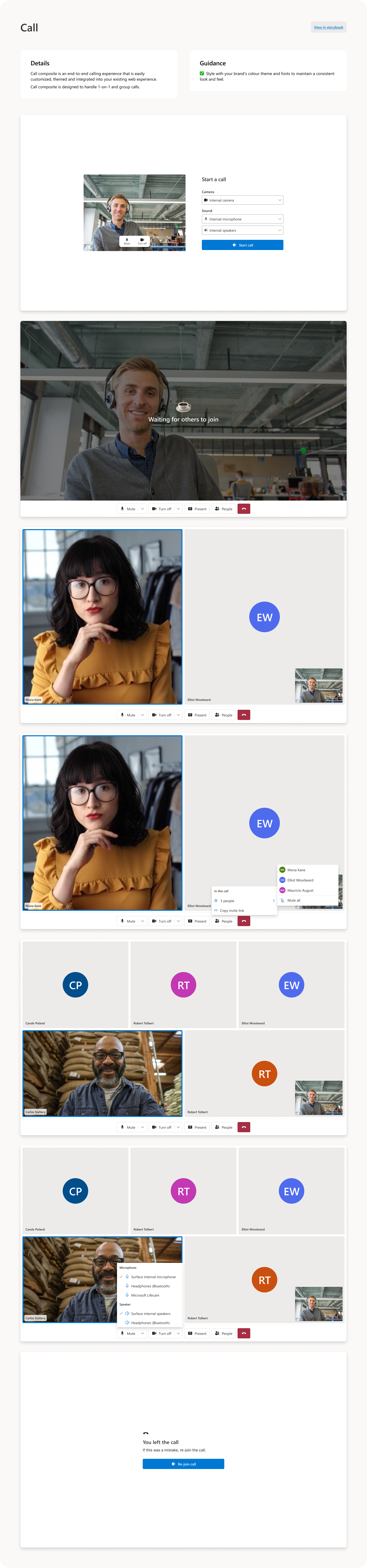
Our designs were based primarily on the interaction and accessibility patterns of the Fluent design system, with some refinements specific to comms based on Microsoft Teams interaction patterns. As our set of Teams interoperability features gets more and more fleshed out, we are increasingly focused on UI Components that provide affordances to Teams features like hand-raise, reactions, rooms, custom backgrounds, etc. We opted to make the look of our components brand-agnostic but easy to customize, to allow our customers to make them conform to their own brand requirements.
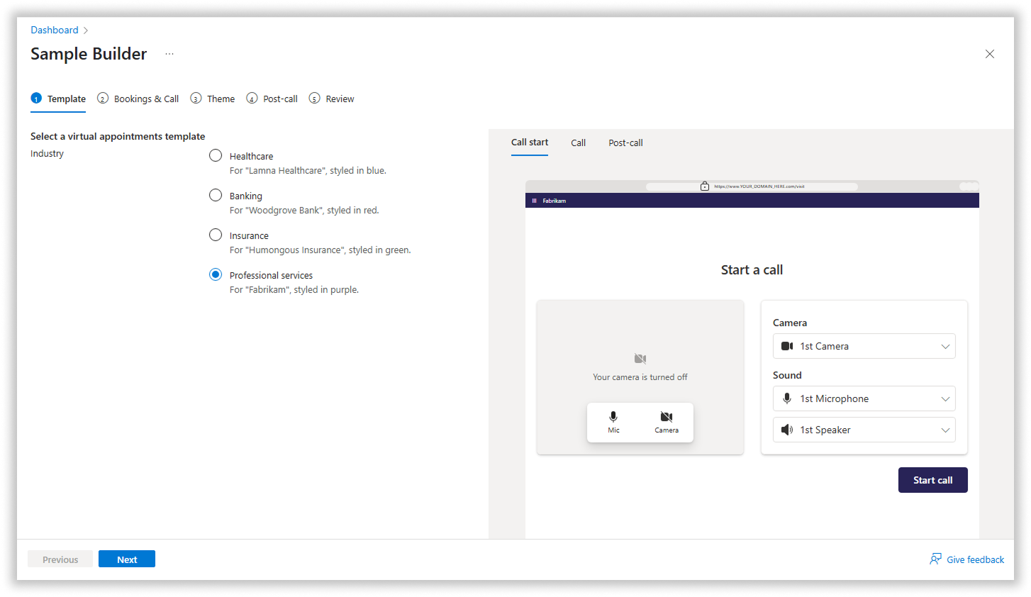
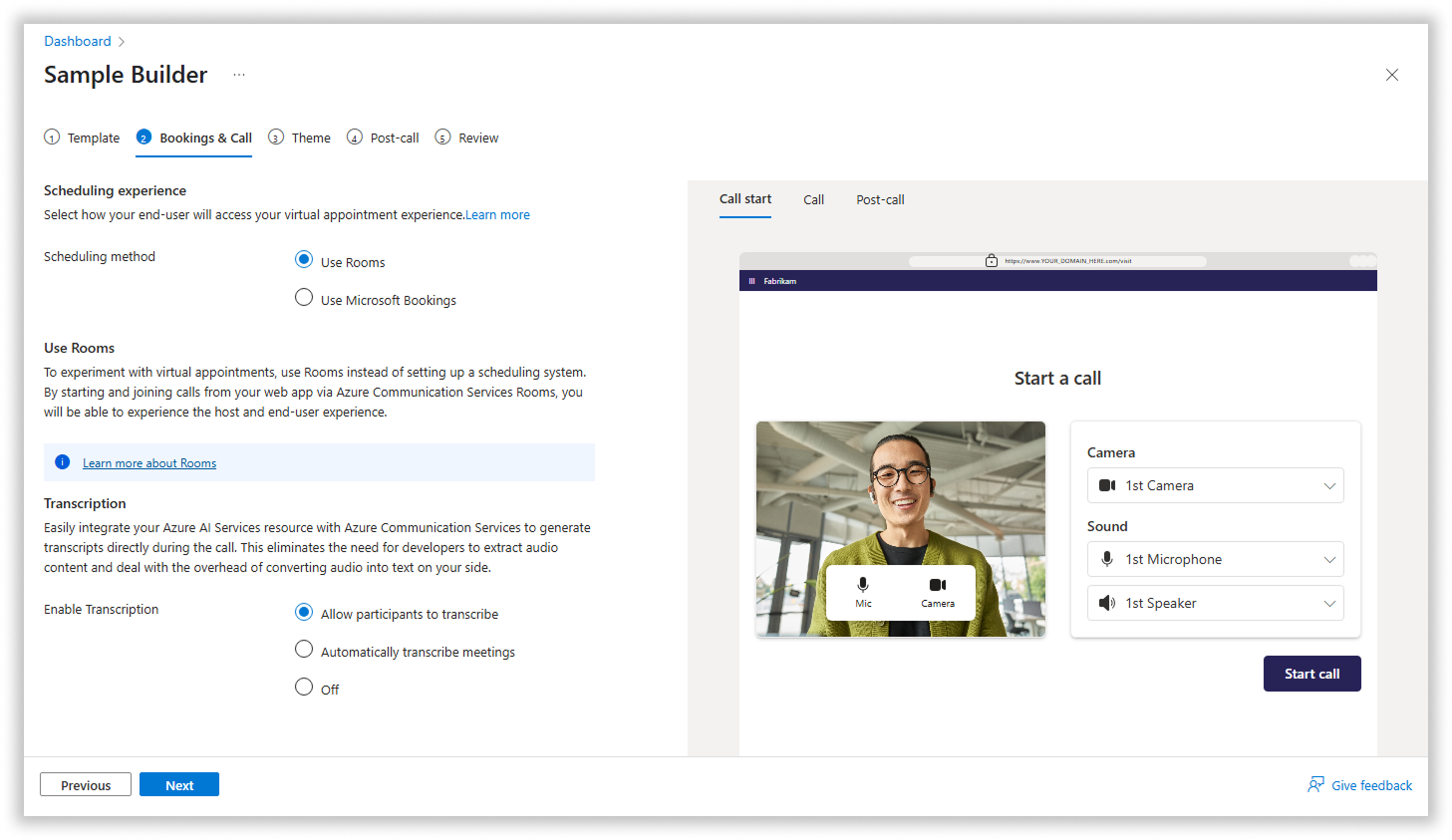
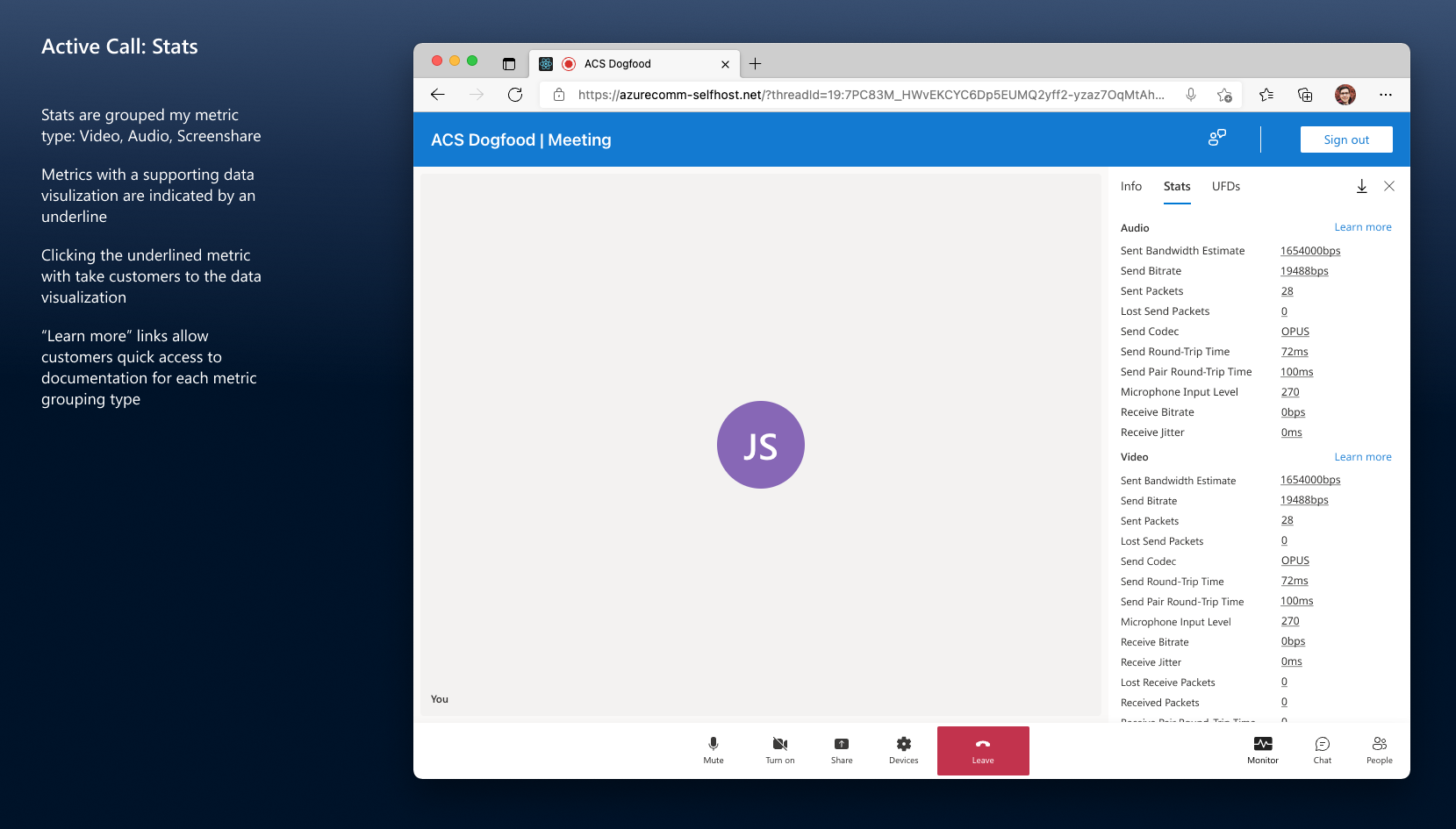
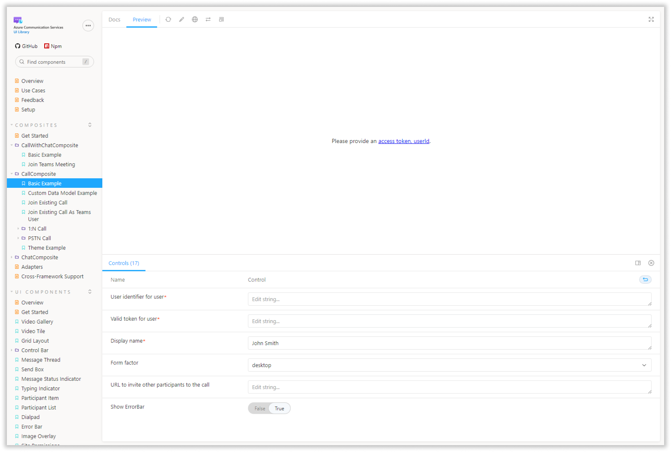
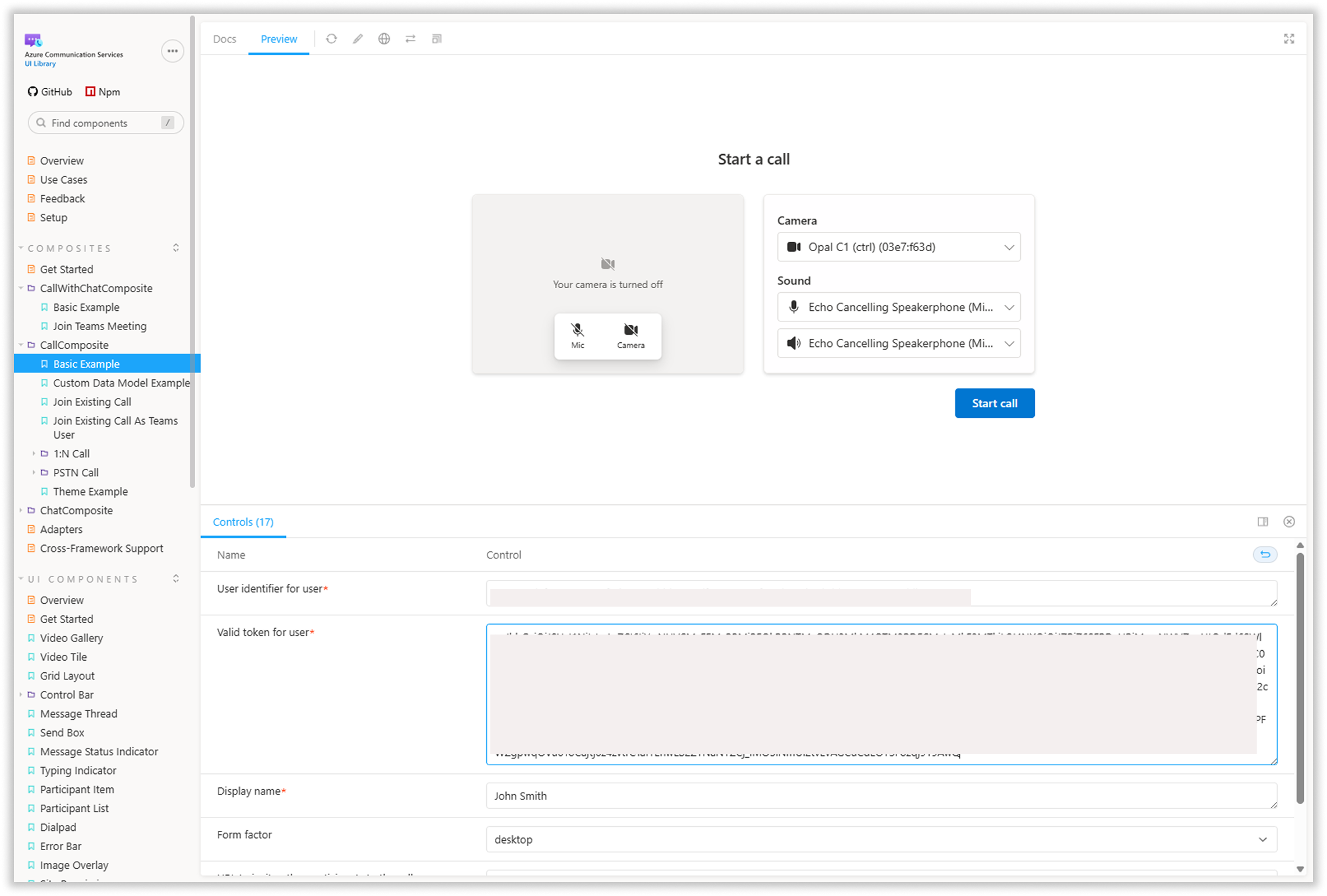
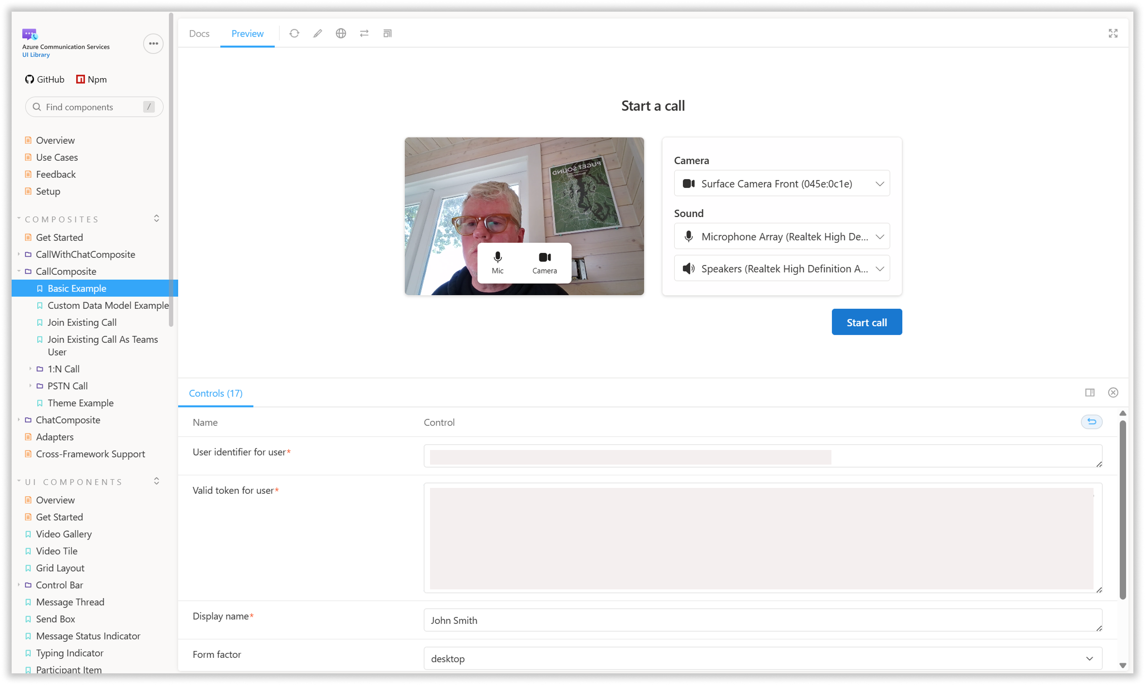
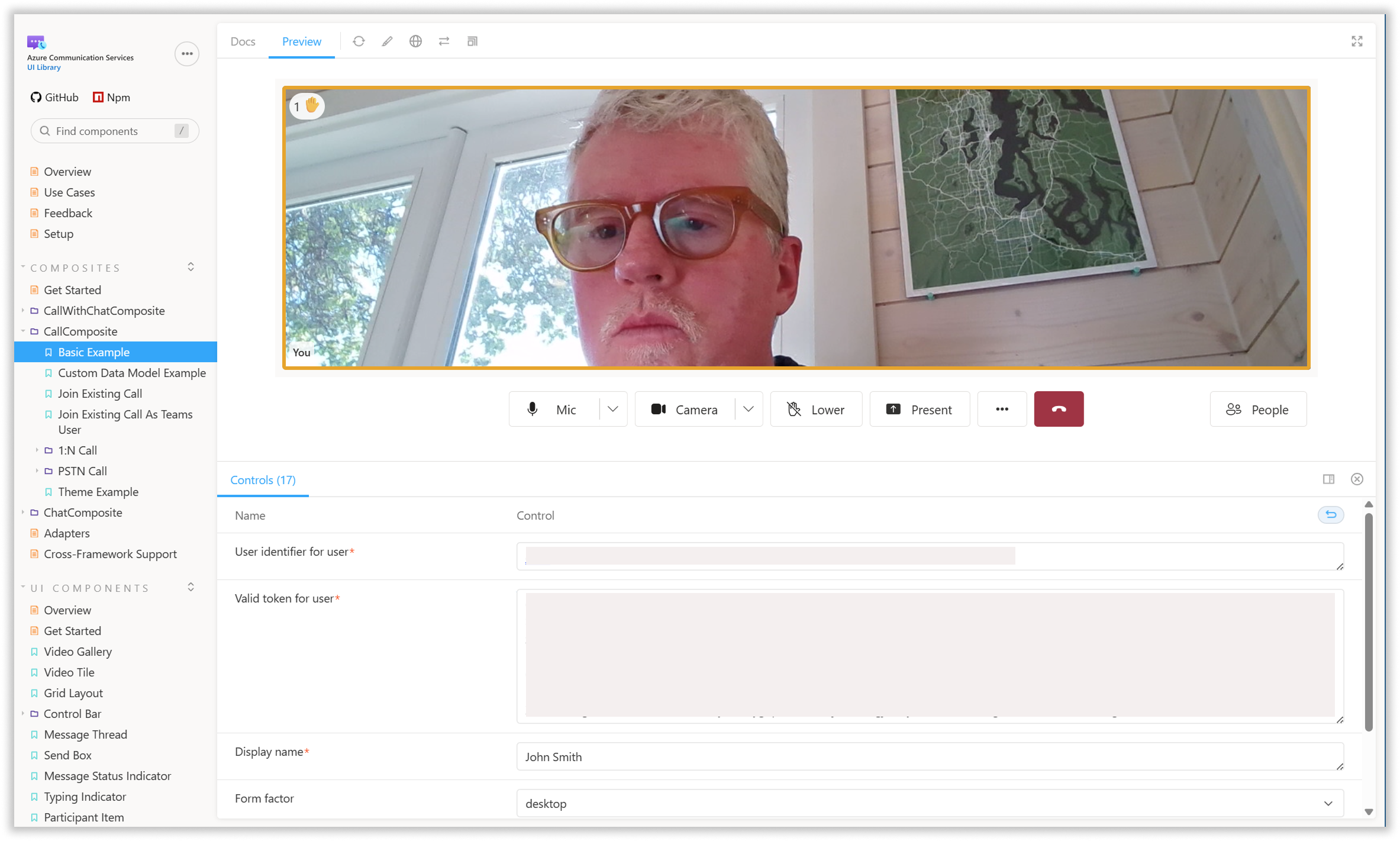
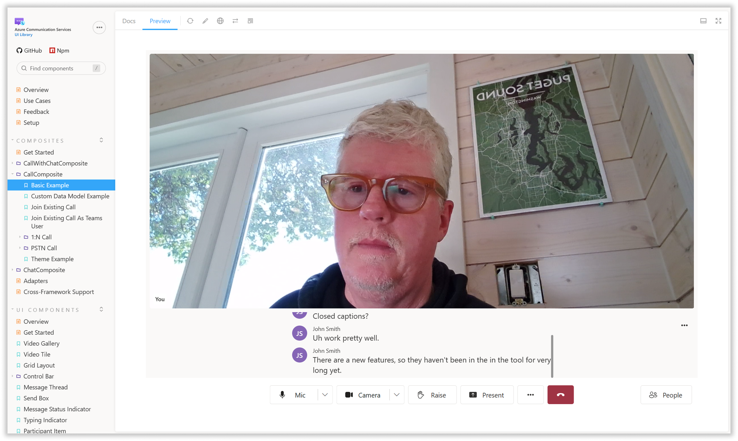
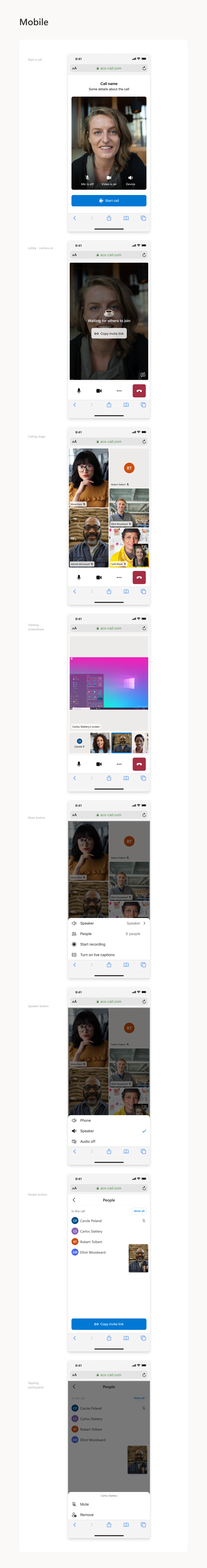
In addition to our suite of components and composites, we also created a full set of interactive documentation specifically for UI Library, which allows users to try out the various APIs and see them in action with live camera and audio feeds. Users can see how components and composites will look in both desktop and mobile layouts,
The UI Library has been a success, with one customer claiming that it reduced development time of his team's project by an entire man-year. We see the majority of our usage coming through the web components, while we see mobile native usage lagging behind. We will be adding new AI-focused features to UI Library in FY26.